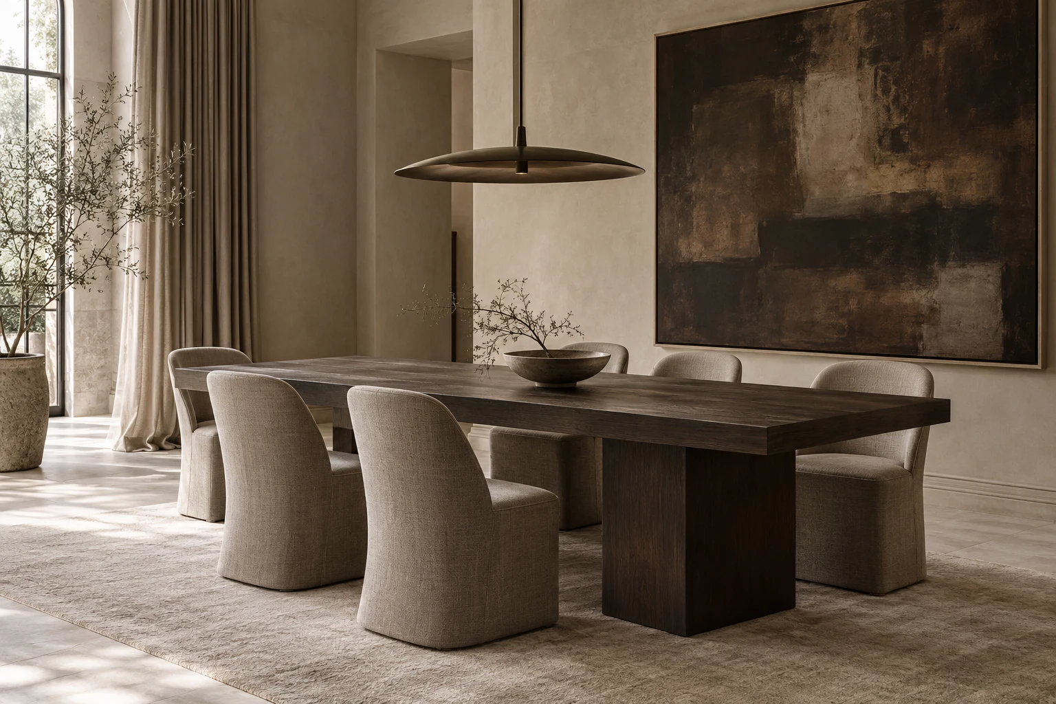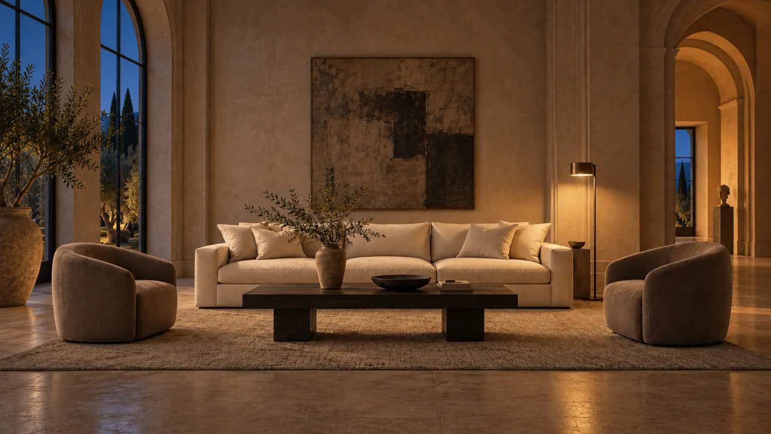
A restrained palette can hold an extraordinary amount of variation. Its character comes from the grain of a surface, the depth of a shadow and the way different textures meet. Begin with a small family of materials, then consider what each one contributes to the whole.
Find a common undertone.
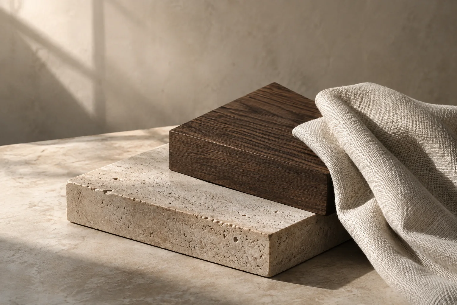
Place the materials together before judging them individually. An ivory textile can appear warm beside one stone and cool beside another. Look for a relationship across the group: soft mineral tones, earthy browns or a quiet gray thread. A shared undertone gives the palette continuity while leaving room for differences in color, pattern and finish.
Give each material a role.
In this study, warm honed stone provides a calm field, dark wood adds depth, and woven neutral fabric brings softness. The proportions matter as much as the choices. One material might occupy a broad surface while another appears in a smaller, more concentrated gesture. Lay out samples in roughly the balance you imagine for the room, rather than in identical squares.
Read the surface in the light.
Look at samples where the finished pieces will live. Turn them toward the window, move them into shade, and return to them in the evening. A surface that feels quiet in diffuse daylight may become more pronounced under a nearby lamp. Consider sheen alongside color: a matte plane and a reflective detail can create variation without introducing another hue.
Vary the scale of the texture.
Let a broad wood grain sit beside a finer weave, or a visually quiet stone beside a more tactile textile. When every surface has equal intensity, the palette can feel busy despite its limited color range. View the samples from across the room as well as close up. Some details should register immediately; others can reward a closer look.
Bring the palette back to daily life.
A material choice needs to suit how a room is used. Before ordering a finished piece, review its confirmed composition, finish and care guidance, and request physical samples when they are available. Photographs are a starting point. The most useful palette is one you enjoy seeing, touching and living with, through the different moments of an ordinary day.